How to use the DIT: Dashboards
This page outlines how to use the Data and Improvement Tool’s dashboards to view your organisation’s data.
Accessing the NACEL DIT Dashboards
The Dashboard view of the NACEL Data and Improvement Tool presents a summary of each of the 10 NACEL Primary Drivers. To get to this view, select the ‘Dashboards’ tab at the top of the page.

You can then view the results for each driver by navigating through the tabs. Please note, Dashboard 10 is split into two sections – ‘Organisational’ and ‘Staff and Family’. Make sure you toggle between them to see all the data

The dashboards display the results for Category 1 and Category 2 deaths. The percentages shown exclude blank and ‘N/A’ responses. The dashboards are updated quarterly; as the Overview and Explore view of the DIT update live, the results may not match.
How to select a submission
The list of organisations and submissions are sorted alphabetically. The top submission in the list will be selected by default. Scroll through the list of submissions and choose the submission you’d like to view.
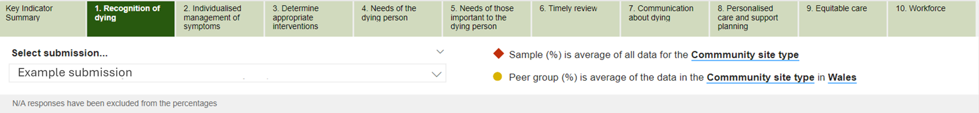
To allow you to contextualise a submission’s results, icons indicate the regional and national result for the site type of the selected submission.
Red diamond = England, Wales and Jersey (acute or community site type)
Yellow circle = The region of the selected submission (acute or community site type)
Tip: Hover over the submission bar, or regional and national position, to see a breakdown of the results.
How to interpret the dashboards
Key Indicators Summary
A new view in the dashboards, the Key Indicators Summary page displays the results and sample size for each of the NACEL Key Indicators, which represent each of the Primary Drivers. These results display for the selected submission, the submission’s peer group, country (England, Wales or Jersey) and the sample (all data), by site type.
The ‘n’ values represent the denominator - the total number of responses counted (not including N/A)

Primary Drivers
Click on one of the NACEL Primary Drivers along the top of the dashboards to see the selected submission’s results for a selection of charts, compared to the sample and peer icons.


If a submission does not have any data for a certain question, or the result is 0%, the bar will not display however the icons will still show the regional and national result.

The source of the data (the audit element) shows underneath each chart.
The charts are also colour coded.
Case Note Review = Green
Quality Survey = Purple
Staff Reported Measure = Blue
To enlarge an individual chart, hover in the right-hand corner of the chart for the ‘focus mode’ icon to appear. Once selected, the chart will expand into a bigger view.
Hospital/Site Overview charts
The charts displaying Hospital/Site Overview results are slightly different, as the charts only display the national and regional results.
In these charts, the national results are displayed as a red bar and the regional results are displayed as a yellow bar.
The submission’s findings can be found in a box below the bars. This is not shown in the chart, as this is a single response to a question and not a percentage.
